How Color Sets the Mood
Two artists can both use blue and feel nothing alike. What changes the feeling is how the color is tuned. There are three dials, and you set each one on purpose.
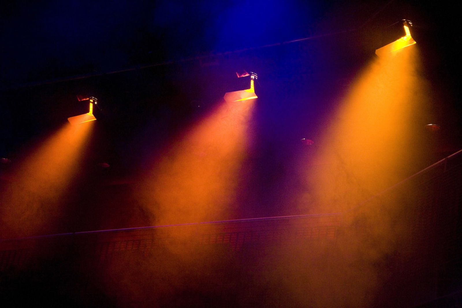 Photo: “Stage lights 3” by DanBrady, CC BY 2.0.
Dial 1: temperature
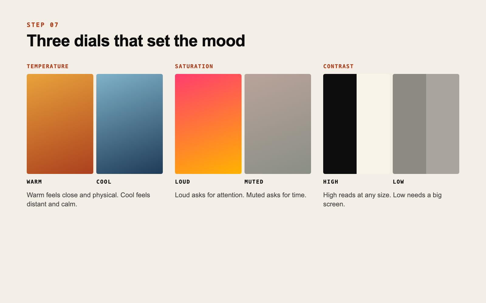
Warm colors (reds, oranges, yellows, warm browns) feel close and physical. Cool colors (blues, greens, cold grays) feel distant and calm.
This applies to photos as much as to graphics. The same portrait graded warm or cool tells two different stories about the same person.
Dial 2: saturation
Saturation is how intense a color is. Fully saturated colors are loud and young and they ask for attention right now. Muted colors are quieter and ask for a little time.
Neither is better. A loud palette on slow, intimate music is a mismatch, and so is a washed-out palette on a record made for dancing.
Dial 3: contrast
Contrast is the distance between your lightest and darkest tones. High contrast is direct and graphic and it reads at any size. Low contrast is soft and atmospheric, and it only works when the image is big.
Remember step 2: most people see you small. If your words pull you toward low contrast, keep it for big surfaces and make sure your cover and profile picture still have one strong light and dark relationship.
Set the dials with your words
Go back to your three words and place each dial.
Nocturnal, warm, unhurried gives you warm temperature, muted saturation and medium to high contrast. Restless, bright, synthetic gives you cool or mixed temperature, high saturation and high contrast.
Color choices get easy once you stop asking “which color?” and ask “how warm, how loud, how much contrast?”
Now look at the palette from step 6. Does it sit where the dials say? If your main color is right but too loud, lower its saturation and keep it. Adjusting is better than starting over.
Do this now
Write one line in your notes with your three settings, for example: “warm, muted, high contrast.” Adjust any palette color that disagrees and update its hex code.
Tuning color to the music is the kind of decision we make together with the artist. Here is how.
If this is something your project needs, get in touch.
Get new posts by email
Ideas for independent artists. We will send a confirmation email. If you do not see it, check your spam folder.