Pick Your Typefaces
Letters carry tone before anyone reads the words. This step gets you to one or two typefaces that you will use for everything, and makes sure you are allowed to use them.
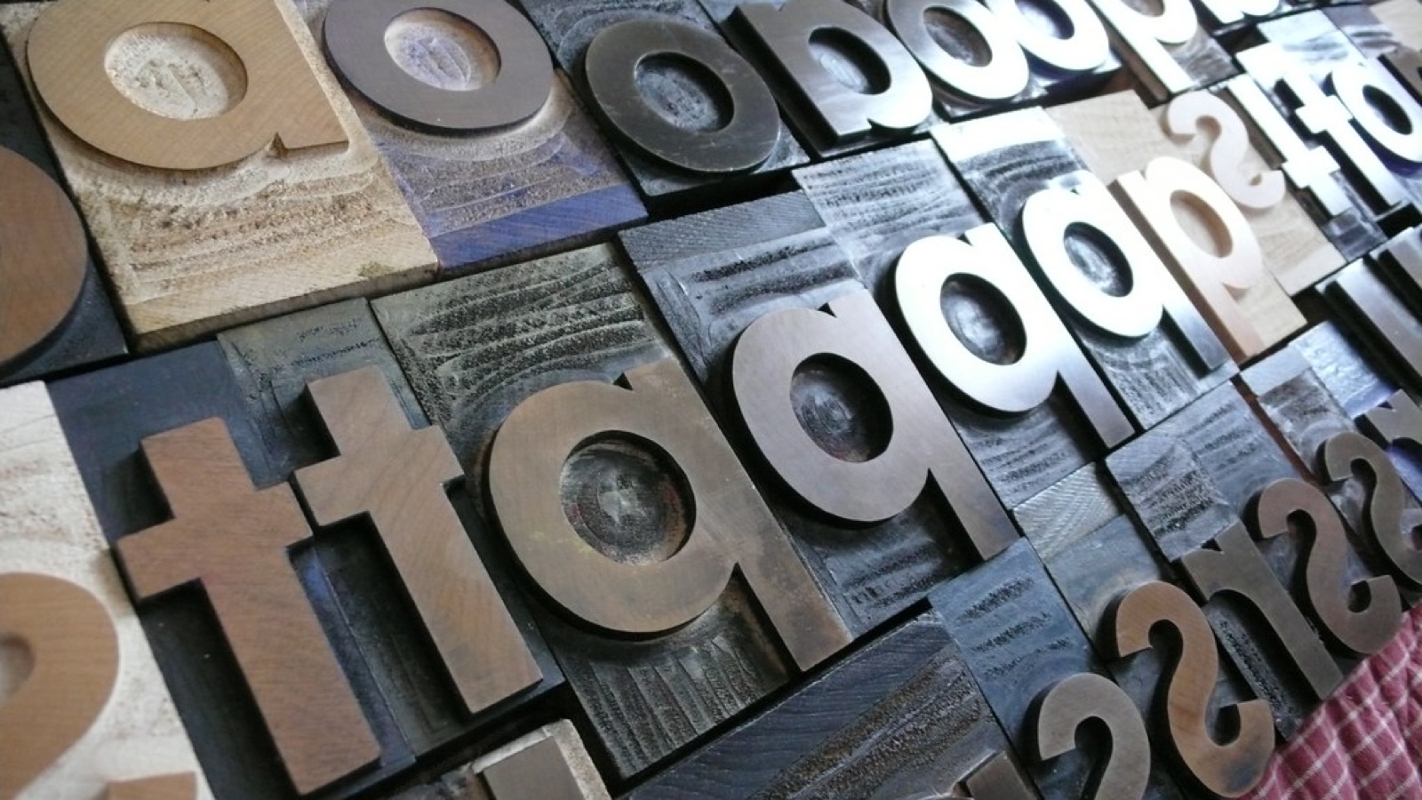 Photo: “gothic san serif lower case - FUTURA!” by kvanhorn, CC BY 2.0.
Two jobs, two typefaces
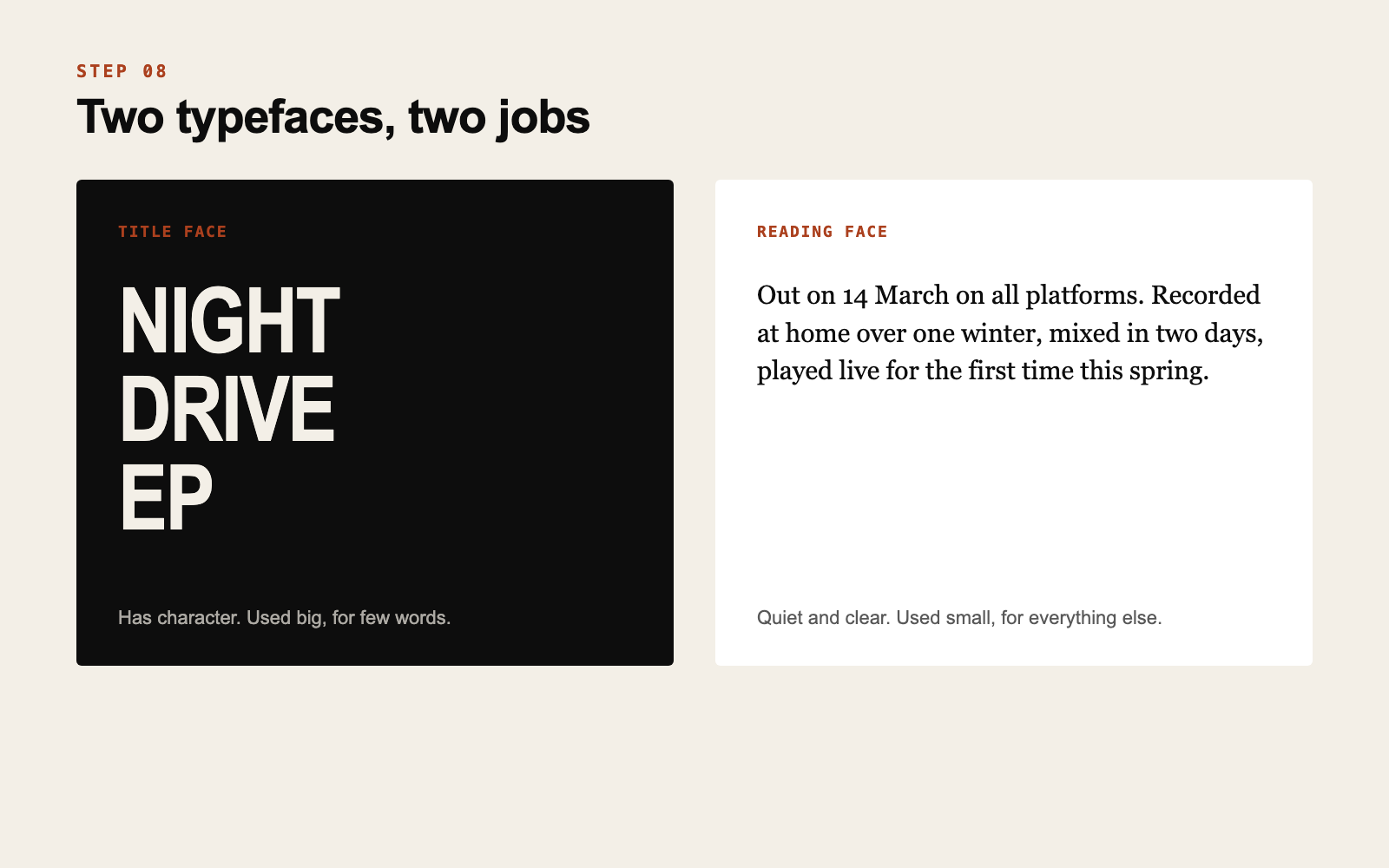
The title face has character. It is used big, for few words: your name, a release title, a date on a poster.
The reading face is quiet and clear. It is used small, for everything else: captions on images, your press kit, tour dates.
One of each is enough. Many strong identities use a single family in two weights. Three or more typefaces almost always look like an accident.
How to choose
Type your artist name and one release title in ten candidates and put them side by side. Then use your words from step 4.
A heavy condensed sans feels urgent and loud. A light serif feels literary and calm. A rounded face feels friendly. A monospaced face feels technical or homemade. Remove everything that argues with your words and compare what is left at a small size.
Avoid the fonts that come preselected in editing apps. They are fine typefaces, and thousands of other artists are using them this week.
Where to find them, legally
Fonts are software and they come with a license.
Google Fonts is a large library of open source typefaces that are free to use, including commercially. Other libraries and foundries offer free and paid options with their own terms. Fonts found on random download sites are often marked “free for personal use”, which does not cover a release, merch or anything you sell.
Check the license before you fall in love with the letters. Changing a typeface after a year of covers is expensive.
When you download a typeface, save the license file in the same folder. If you ever print merch or sign with a label, someone will ask.
Write the rule
Decide the details once: title face in capitals or not, tight or wide letter spacing, which weight. These small rules are what make your titles look related to each other.
Do this now
Choose your title face and your reading face, save the files and their licenses in one folder, and write the usage rule in two lines.
Choosing and pairing typefaces for a project is part of what we do. See our identity work.
If this is something your project needs, get in touch.
Get new posts by email
Ideas for independent artists. We will send a confirmation email. If you do not see it, check your spam folder.