Design Cover Art That Reads Small
Most covers are designed big and seen small. This step is a short method for making artwork that still works at the size of a fingernail, and a way to test it before you commit.
 Photo: “Headphones Music” by JESHOOTS.com, CC0.
One idea
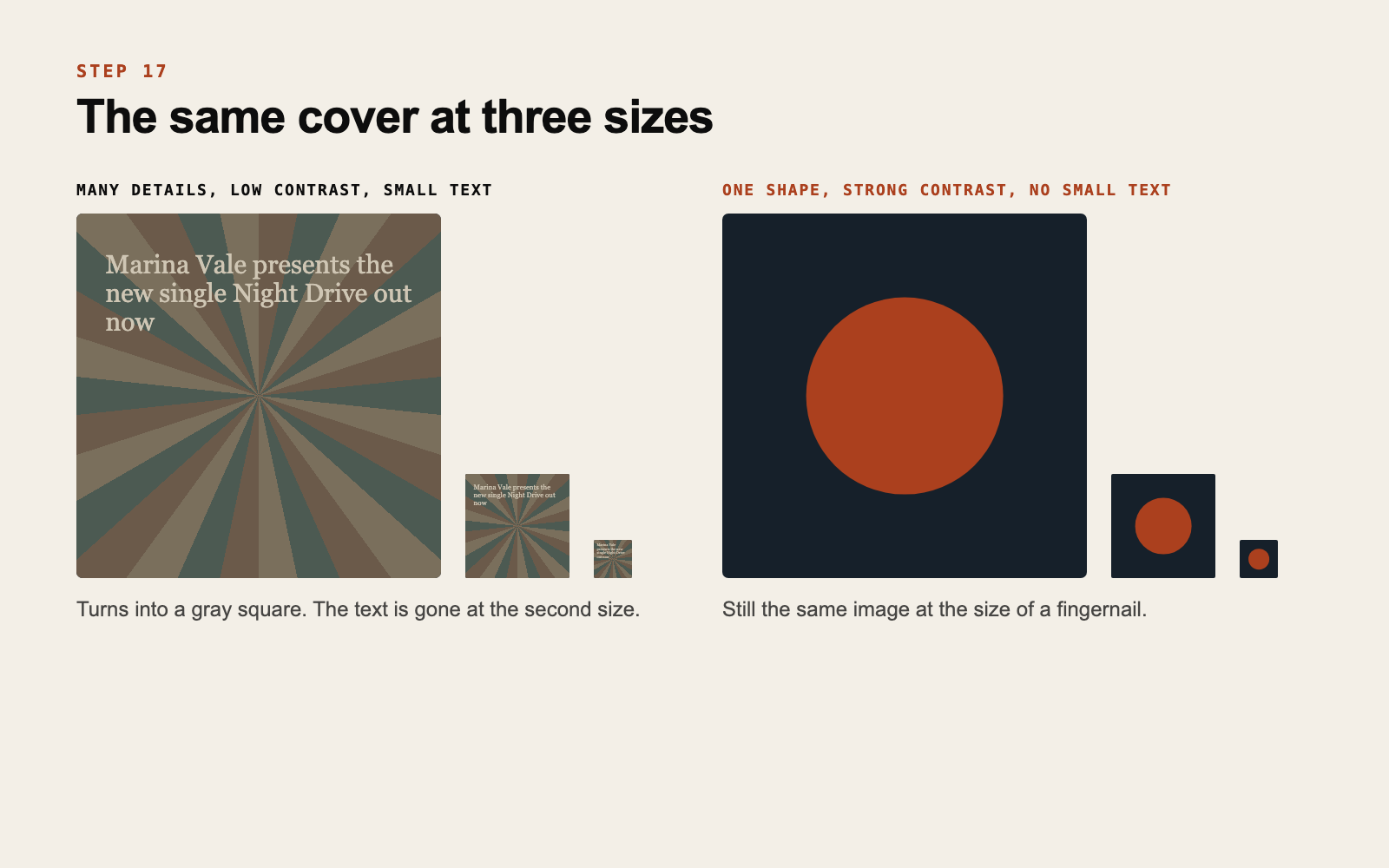
A cover that reads small has one main element: a face, a shape, an object, a word. Everything else supports it or leaves.
If you describe your cover and need the word “and” more than once, it is carrying too much.
Strong contrast
At small sizes, fine differences vanish and only big relationships remain: a light thing on a dark ground, or the reverse.
A fast check is to view the artwork in black and white. If the main element melts into the background, it will melt at thumbnail size in color too.
Keep the edges quiet
Apps round the corners, overlay icons and crop slightly. Keep the main element away from the borders, with a margin of about a tenth of the width on each side.
Text, if you use it
Big or absent. Small type on a cover becomes texture. If your name is on it, use your wordmark from step 9 at a size that survives the shrink. If it cannot be big, leave it off. The platform prints your name next to the image anyway.
Test before you decide
View the artwork at three sizes: full screen, about the size of a coin, and as small as a track thumbnail. View it on a light and on a dark background, and next to other covers.
We built a free tool for this. The Cover Tester shows your image at thumbnail sizes, in a playlist row, in a profile grid and in a story. The image stays in your browser.
If the cover works as a tiny square, it will work everywhere else.
The file
Distributors generally ask for a square image, commonly 3000 by 3000 pixels, in JPG or PNG. Requirements change, so check what yours asks for before exporting. Keep an editable master with layers. Step 18 uses it.
Do this now
Run your current or next cover through the three sizes. If it fails at the smallest, remove one element and test again.
If you want a cover designed and tested with you, that is part of our release work.
If this is something your project needs, get in touch.
Get new posts by email
Ideas for independent artists. We will send a confirmation email. If you do not see it, check your spam folder.