Put Text on Images Without Ruining Them
Show dates, release announcements, lineup posts: sooner or later you put words on top of a picture. Three rules keep the text readable and the image intact.
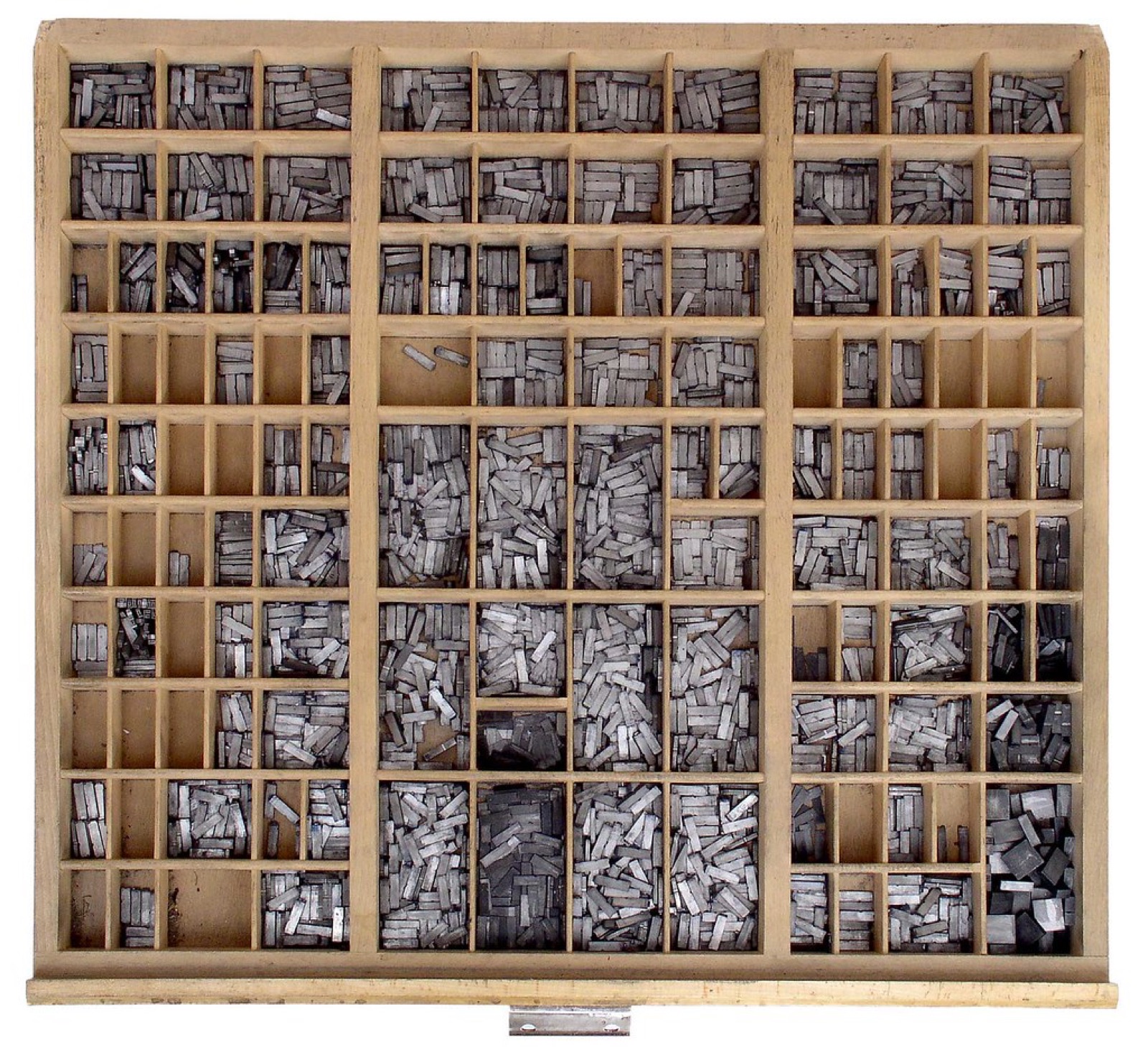 Photo: “Setzkasten” by wilhei55, CC BY 2.0.
Rule 1: three levels, no more
Decide what is read first, second and third, and make the difference obvious.
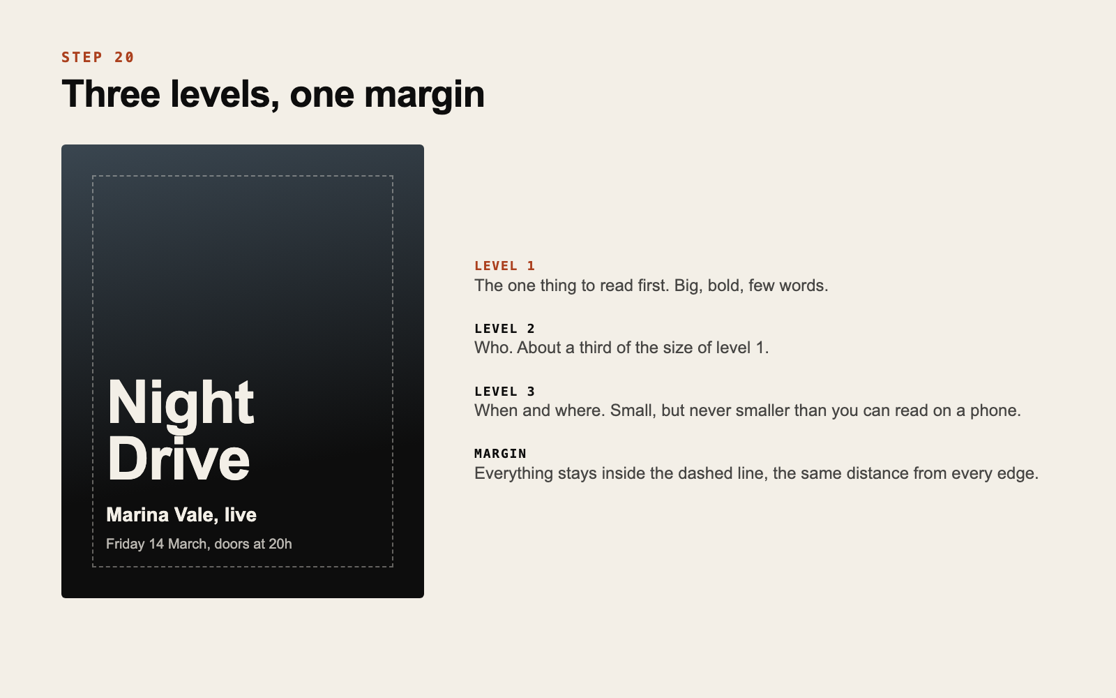
- Level 1: the one thing that matters. A title, a date or “out now”. Big and bold.
- Level 2: who or what. Roughly a third of the size of level 1.
- Level 3: the details. Small, in your reading face.
If everything is the same size, people read nothing. If you have more than three levels, move the extra information to the caption.
Rule 2: one margin
Choose a distance from the edge and keep every piece of text inside it, the same on all four sides. A generous margin, around 6 to 8 percent of the width, looks calm and deliberate.
Align text to one side. Left-aligned text along a single invisible line looks organized with no further effort. Centered text works for very few words.
Rule 3: contrast with the background
Text is readable when it sits on a quiet area that is clearly lighter or darker than the letters. You have four ways to get there:
- Place the text on a naturally calm part of the photo: sky, wall, shadow
- Darken the whole image slightly
- Add a soft gradient behind the text only
- Put the text in a solid block of a palette color
Avoid outlines and hard drop shadows on letters. They are the usual sign of text that was fighting the background and lost.
If you have to squint to read it on your phone, nobody else will try.
Use your own material
Set titles in your title face, details in your reading face and colors from your palette. Ask photographers for a few frames with empty space, as you planned in step 11, so the text has somewhere to go.
Less text than you want
An image carries a handful of words comfortably. Dates, ticket links and long explanations belong in the caption, where people can copy them.
Do this now
Take one photo and make a simple announcement with three levels, one margin and your two typefaces. Check it on your phone at arm’s length.
Announcements, posters and date lists in your identity are part of what we make for a release. See our work.
If this is something your project needs, get in touch.
Get new posts by email
Ideas for independent artists. We will send a confirmation email. If you do not see it, check your spam folder.